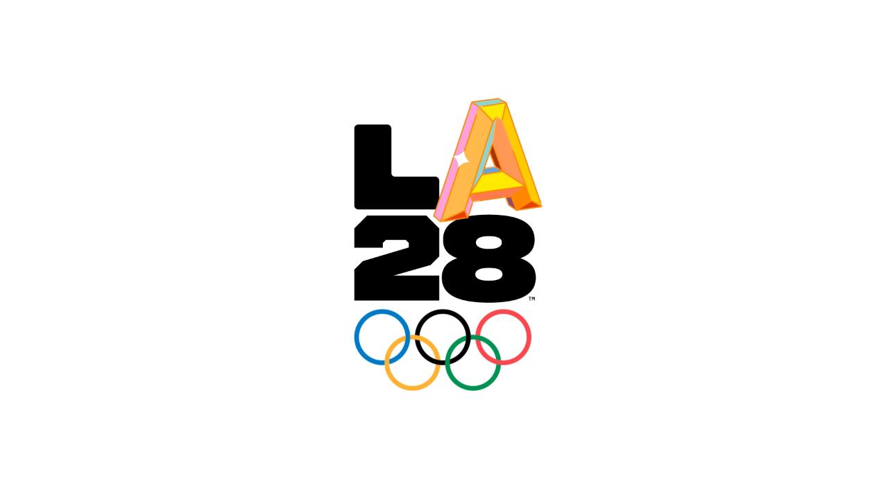
The Los Angeles 2028 (LA28) organizing committee released the design for the emblem of the Olympic and Paralympic Games. Describing the emblem as “a collection of voices to represent LA and the Games,” LA28 recruited athletes and celebrities alike to influence the design, with each developing their own view of what the logo should look like.
Four-time Rio Olympic medalist Simone Manuel and Paralympic National Champion Jamal Hill are the only representatives from the sport of swimming in the athlete lineup.
Both the design by Manuel and the one by Hill have water-like elements to them. An animation of Hill’s features an A that emerges from water bubbles and then is magnified by them.
“You see the whole world through the eyes of Los Angeles,” Hill says of his inspiration. “It’s a magnifying glass of the American melting pot.”
Meanwhile the design for Manuel, who won 2 gold and 2 silver medals at the 2016 Olympic Games, focuses more on the splash elements of water than the bubbles, with the letter A emerging with a splash and then a multi-colored splash running through it.
“Dream big, dream bold, and dream beyond traditional assumptions,” Manuel said of the inspiration for her inspiration-themed logo.
The logo is innovative in that it doesn’t exist as a single image; rather, it exists as a collection of community-inspired images that replace the A in “LA28” with different stylizations and visions of the letter which represent the different stylizations and visions that the Olympic Games bring together, and the diversity of the city.
“LA defies a singular identity,” a description on the organizing committee’s website reads. “Los Angeles is more than a city. It’s a mindset. A movement. Millions of people speaking hundreds of languages coming together under two iconic letters. LA is an infinite canvas to pursue your wildest dreams.
Janet Evans, a four-time gold medalist from the Barcelona and Seoul Games holds the Director of Athlete Relations position for LA28.
LA28 focused on creating a digital and animated emblem in order to “keep fresh for the unprecedented eight-year journey to the Olympic and Paralympic Games in LA.” The dynamic logo had a direct influence from LA-based artists and Olympians, especially Allyson Felix, a nine-time medal winner in track. “I’ve been surrounded by excellence growing up here. People in LA are doing incredible things and it’s hard for that not to rub off. You want to be better when you’re here,” said Felix.
“There has never been a more important time to give rise to athlete voices,” said LA28 Chairperson Casey Wasserman. “Sports are a special part of our global culture, connecting people and fans across communities and around the world. The LA28 Olympic and Paralympic Games will be a platform for individual stories of triumph, heartbreak and opportunity as we recognize and revere humanity’s diversity and dreams for the future.”
Olympic Emblems through the ages
Los Angeles 2028
We are a community of inspired individuals and fearless dreamers. It’s time we made our mark. #LA28 #LA28Creator pic.twitter.com/XagKkA5d9a
— LA28 (@LA28) September 1, 2020
Paris 2024:
Tokyo 2020:

Emblem for the Tokyo 2020 Games, which have been postponed to 2021 amid the COVID-19 pandemic.
Rio 2016:
London 2012:
Beijing 2008:
Athens 2004:
Sydney 2000:
Atlanta 1996:
Barcelona 1992:
Seoul 1988:
Los Angeles 1984:


Hehe, the olympic logos always look so cool!
Stunningly insightful commentary. Keep up the great work!
Why is the 8 a different font than the L and the 2? It’s the same font in other mockups. Quite the oversight if it wasn’t on purpose.
The focus is on font diversity.
I suppose the L is chunky too. These designers are wild’n out on this one.
They should have done it all in comic sans.
It is my hope that the Olympic committee selects Michael Phelps to light the torch for Los Angeles 2028 just like Muhammad Ali did back in 1996 Atlanta.
The different “A’s” are a very nice touch — it’ll be fun to see how the various sports and athletes customizes their “A.” But overall, no matter which design-y “A” is there, I keep seeing the word “LATE” in it. Having a big block “8” reinforces that impression (because it rhymes with Late).
I am now seeing “too late” and can’t unseen it. Lol.