The play-ins are over in our 2020 International Swimming League Logo Bracket. Who made the second round?
Round 1 Recap
Tokyo Frog Kings (82%) over Energy Standard (18%)
Believe it or not, this was actually the best showing in Energy Standard logo history. That’s right: Energy Standard lost last year’s first round to the London Roar in a 90%-10% blowout. Then in a four-way consolation bracket, Energy Standard got just 6% of the vote to finish 8th of 8 teams last year. So getting 18% of the vote shows… improvement?
The monogram logo itself has some cool potential. But the color scheme is weird enough to hurt your eyes.
On the other hand, Energy Standard won the actual swimming portion of the 2019 ISL season. So we’re guessing they’re OK with a repeat first-round loss in the logo bracket.
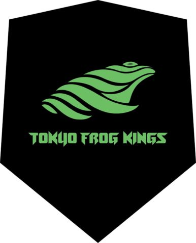
The frog kings logo shows the value of having an actual mascot rather than just a monogram/symbol. The frog is cool, it’s recongizable-but-abstract, and it’s distinctly regal. We are definitely here for it.
A few reader comments about this matchup show that the widely-beloved Tokyo Frog Kings logo is rapidly ascending to comment-section-meme status:
- “The Frog Kings looks like Gamabunta from Naruto. They have the bestest of logos – dattebayo.” – Gamabunta
- We don’t know what any of this means, but we love it.
- “Frog is wonderful. Misses a Royal Crown though.” – Human Ambition
- “The Energy Standard logo is below average. It is simply letters. The red is a little bit too bright and the blues little bit too dark. Red and blue are classic but not retro and this one does not stand out.
“On the other hand The Tokyo Frog Kings did a solid job with its debut. Is emblematic of it name. I personally would add a little yellow crown to the frog. The green is a bit of a change of pace from many teams in the black and the nice contrast although lots of teams do you have a black background. overall very solid logo and I would give the Frog Kings the victory over the Energy Standard.” – Lucas Caswell - “Might as well give the bracket to the frog kings now!” – CACrushers
- “I’m going to buy all the frog merch they’ll sell me.” – Togger
Aqua Centurions (62%) over Toronto Titans (38%)
So this matchup is… underwhelming. In fact, though both polls ran for the exact same amount of time, a small portion of voters in the other matchup just chose neither in this one, abstaining from the vote.
The Aqua Centurions had their issues last year. (Someone described it as “a default title page of Microsoft PowerPoint,” which seemed very accurate). But they didn’t make any changes this year. The helmet logo could actually look pretty cool on a swim cap… except that last year it was printed at basically the size of a postage stamp. Make the logo bigger (think the Michigan State Spartans football helmets) and this logo could improve immediately.
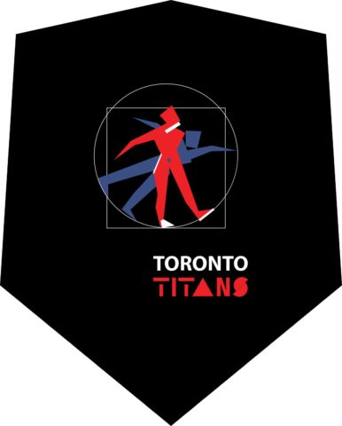
The Titans logo, meanwhile, has been pretty widely panned. What’s most disappointing about it is how little it seems to resemble anything Titan. Or anything swimming. The logo is two human figures, neither of which appears to be swimming. (The blue one might be diving off the blocks, though it seems to be doing some sort of weird technique where one arm does the Dressel-arm-circle and the other arm does a traditional forward throw. The red one appears to be starting a diving approach on a springboard, which is odd in a league that doesn’t feature diving at all.)
A few reader comments about this matchup:
- “Titans have to much going on and no cool colors or logos. Aqua Centurions have a cool logo and the white background stands out against the other teams” – Lucas Caswell
- “The Titans one is so bad, that it’s good. I think I might want a T-shirt.” – SCCoach
- “I actually don’t understand how Toronto’s logo ended up that horrible.” – MDE
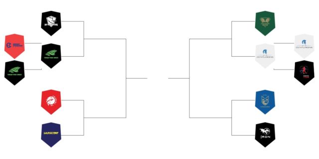
The Bracket
Round 2 Matchups
NY Breakers vs Tokyo Frog Kings
Which ISL team has the better logo? (Round 2)
- New York Breakers (55%)
- Tokyo Frog Kings (45%)
DC Trident vs LA Current
Which ISL team has the better logo? (Round 2)
- DC Trident (63%)
- LA Current (37%)
London Roar vs Aqua Centurions
Which ISL team has the better logo? (Round 2)
- London Roar (82%)
- Aqua Centurions (18%)
Cali Condors vs Iron
Which ISL team has the better logo? (Round 2)
- Cali Condors (52%)
- Iron (48%)
9th-Place Match: Toronto Titans vs Energy Standard
Which ISL team has the better logo? (9th Place Consolation)
- Toronto Titans (51%)
- Energy Standard (49%)







NY breakers over Tokyo Frog Kings
I want to see some of this frog kings merch asap
energy standard sounds like an oil company and the logo matches that perfectly
In fact Energy Standard Group was originally something similar to oil companies. Grigorishin named the club after his business.
Half of these are just bad. ISL had such a good opportunity to create a solid design guide and language among the teams but some of the owners just made them in microsoft word (titans). The ISL logo also has no intention behind it, just a weird “swimmer” and a random polygon that “looks cool”. Rebranding needed. Take inspiration from the AAF (RIP) or the XFL (almost RIP, again).
The Frog Kings is the only Logo that I love. And I like the Tridents one. Both feel very swimming.
Condors isn’t too bad.
Roar, Iron and Breakers look fine, but there is nothing uniquely swimming about them, they could just as easily be a team in any other sport.
The rest are absolutely terrible.
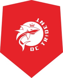
DC trident vs LA current is like a battle of the worsts. I just don’t really understand the trident logo at all; why is there are a shark? There’s not even a real trident
Sharks crown is a Trident.
I actually like it. It is a logo that feels pretty uniquely ISL.
LA Current ‘logo’ isn’t even a Logo, it looks like an NFL end zone.
Honestly rip to the aqua centurions. The London roar logo is miles ahead
I think that the frog kings versus the breakers is one of the best possible matchups. Love the green and black of the frog kings, but the breakers logo is just so good. I’ll give the edge to the kings because I like the colors over just the black and white theme.
Roar has got the best logo overall
Stop the cap. Frog Kings stay undefeated
Looks like a cricket team logo.