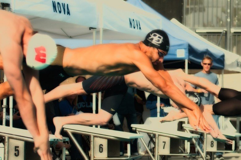
Earlier this evening, we posted a brief discussion with some reactions about the USOC cap rules that are causing issues both for swimmers as well as cap manufacturers headed into the Olympic Trials.
But we’re a swimming community. And if there’s one things that swimmers love, it’s numbers. So let’s talk numbers
In a fit of curiosity, I decided to grab a stop-watch and see how much of a difference logo placement on a cap would make between the front and back placement (which were allowed at the 2008 Trials) and the “above the ear” placement that is being enforced by the USOC in 2012.
Our test case: the 400 IM Olympic Tirals video from 2008, seen below (posted on YouTube by leedsmith2).
The key to the rules is the specification that the logo be “above the ear.” There’s a sweet spot for logos that is sort of on that curve where the “side of the head” turns into the “front of the head”. You can see, for example, the Speedo logo on Ryan Lochte’s cap in the above video. that logo can be seen pretty well from multiple angles.
But the USOC has made it fairly clear that the manufacturer logo most be “above the ear”. So I went through and timed this race to see how much time is spent focusing on the more-traditional “side of the head” as compared to the “front of the head”.
I only timed where the camera was close enough to easily see the logos, so the side-pool shots during the race were mostly wiped-out. The money-times are before and after the race, where NBC’s cameras came in to capture tight shots and get the swimmers’ emotions.
Though the hand-timed system is far from accurate, the results showed a clear disparity: Roughly 1:55 was dedicated to the front or back of a swimmers cap, whereas right around a minute of side-cap time was shown in the 8 minute 50 second video.
If we assume that this presentation is representative of other finals at the meet (and it seemed pretty standard), we can conservatively call that 50 seconds of lost airtime to the cap manufacturers per race by moving the logos to the side of the head.
What this means is that, in the 26 individual finals alone, that’s over 21 minutes of lost advertising space for those athletes fortunate enough to have a cap sponsorship. 21 minutes is a huge chunk of time, and something the advertisers will be forced to take into account when deciding how to spend their marketing dollars on athletes.
There are some more qualitative observations to take into account here, that are sort of counteracting forces. The first is that the iconic moments tended to focus on the side of the head. Phelps’ post-World-Record celebration was exclusively focused on his ear-hole. Phelps and Lochte’s post-race embrace and conversation also showed the side of the head. But Phelps and Lochte aren’t exactly scraping together dollars to try and extend their careers – and that’s where this really hurts.
For those swimmers outside of the primary contenders, the footage was almost exclusively the front of their heads (during pre-race introductions mostly). That is those swimmers’ best opportunity to perhaps convince a suit manufacturer that their forehead is worth a few bucks, maybe a free suit, or whatever else they can negotiate for to just try to survive until the next big meet and not have to hang their suits up early.
This will increasingly drive-up the importance of “brand recognition” for the suit manufacturers. The iconic logos, those that have become Pavlovian in their recognition, are more easily identifiable to the swimming-niche, and they could get more bang-for-their-buck from wider shots, or just a quick glimpse as an athlete turns their head. If these are the new rules in play for good, smaller manufacturers will have to work on putting their logo in front of swimmers’ eyes as frequently as possible (at Grand Prix meets, college meets) to have equivalent marketing success.
For what it’s worth, I couldn’t make out a single logo on anybody’s goggle straps.

Haha, I like the experiment.
This whole thing is so stupid, though. Caps and suits should be able to be filled with as many logos and advertisements as possible. Make ’em look like NASCAR jumpsuits, who cares?
You captured my thought exactly – that would be wild.
I’d go even further, and say if swimmers want to put tattoos (permanent or not) in their bodies, so be it!
In fact, I’d be interested to see what would be the reaction between USOC and USA Swimming if an athlete had a permanent tattoo of a corporation (a friend of mine does have a coke bottle in his arm, despite never getting any $ for it). Are they permanently ineligible for the Olympic team?