Courtesy: Triangle Sports Commission
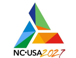
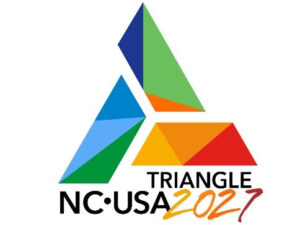
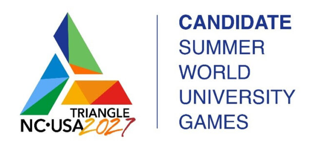
Orlando, Florida and Cary, North Carolina: The U.S. International University Sports Federation (USIUSF) and the North Carolina Bid Committee (NCBC) today unveiled the logo for the United States Bid for the 2027 Summer World University Games.
“We are excited to make public today the iconic look we’ve chosen to represent our efforts to bring the 2027 Summer World University Games to the United States,” said Dan Guerrero, President of the USIUSF. “We’ve enjoyed working with our North Carolina host city partners in the design process and look forward to continuing our partnership through the bid – and beyond!”
The central design element of the bid logo is a triangle, the three vertices of which represent the three geographical areas in the forefront of the bid: the United States of America, the state of North Carolina, and the Raleigh-Durham metropolitan area.
Two versions of the new logo have been approved: one that features “NC USA” representing North Carolina and the United States, and another with “TRIANGLE NC USA” which more specifically references the research triangle region, the proposed geographic hub of the area’s bid for the Games.
“The USIUSF took pains to ensure the new logo matches up well with, and serves as a strong complement to, the “U” logo of the International University Sports Federation (FISU), the international governing body for the World University Games,” said Delise
“We chose the triangular shape,” said Wendy Coulter, CEO of Hummingbird Creative Group, the graphics team for the NCBC’s design elements, “both because our host community is referred to as the Triangle and because of the strength and symmetry conveyed by a triangle.”
The Raleigh-Durham metro area is said to have come to be called the Triangle either because of the three main cities of the area at the time – Raleigh, Durham, and Chapel Hill – which form a triangular shape when connecting them with straight lines on a map, or because of the prominent role of Research Triangle Park, the world’s largest research park, which is the area’s biggest employment center and is located between the three cities.
“I like the multi-layered aspects of the design,” said Hill Carrow, Chairman and CEO of the NCBC. “You can see that a lot of thought went into it from everyone involved in the process. For example, each of the colors of the Olympic Games, which stand out on the left side of the FISU “U” logo are also included in the bid logo. And my favorite part is that it also contains Duke Blue, Carolina Blue, and State Red in locations in the logo that approximate the locations of those universities on a map.”
While the logo does not quite have the complexity of an MC Escher design, it is worth pointing out that the three components of the triangle in the logo, if pulled together with no space in between, would form an equilateral triangle, the most common triangle used in architecture and the strongest of all geometric shapes. The 4000-year-old Pyramids of Giza in Egypt, all sides of which are constructed as equilateral triangles, underscore the great strength and stability of the equilateral triangle shape.
Note, too, that each component of the main equilateral triangle also contains three smaller triangles of varying shapes. These multi-colored interior triangles represent the multi-cultural composition of the Triangle region that come together in a lattice-like structure that adds even more strength, power, and stability to the Triangle.


