With the International Swimming League (ISL) set to make some major announcements regarding Season 2 on Wednesday, the logos and subsequent team rosters are now listed on the league’s website.
The league’s two new teams, the Toronto Titans and Tokyo Frog Kings, have the following logos featured:
TORONTO TITANS
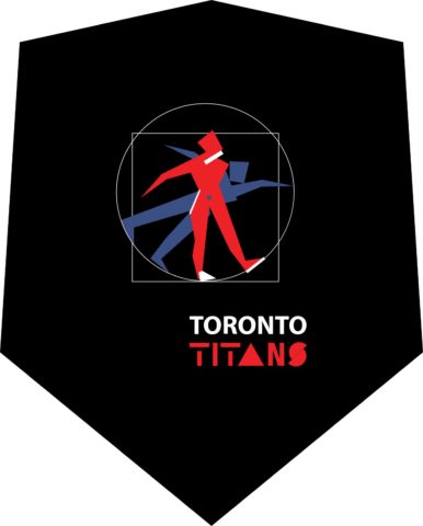
The Titans logo features a red, blue and black color scheme, with a swimmer in the middle diving into the water. It doesn’t step on the toes of any of the other team’s colors, coming closest to Energy Standard, who are primarily red and blue, and the DC Trident, who are red and white.
TOKYO FROG KINGS
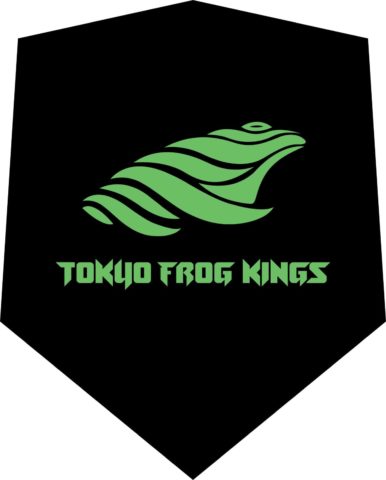
The Frog Kings, as you may have anticipated, have a green frog as their logo with a unique typeface for the team name and a clean black background. The green/black combo doesn’t closely resemble any of the other team logos.
ORIGINAL 8 TEAM LOGOS FOR SEASON 2








Frog Kings are winning the PR battle with the awesome name and logo
That Toronto logo might be the worst logo in pro sports.
I’ve watched a lot of pro sports around the world, but maybe I’m missing something.
Anybody have any other candidates?
Here’s a FoxSports list of worst logos in history: https://www.foxsports.com/buzzer/gallery/worst-sports-logos-in-history-ever-nfl-nba-mlb-la-chargers-49ers-011817
Most of those, I think, were fine in context.
Here’s a Bleacher Report take: https://bleacherreport.com/articles/547639-the-120-worst-logos-of-all-time
Some of those are really old. I wouldn’t expect a logo from 1925 to necessarily hold up to modern design standards.
I’d say that Coyotes alternate logo and the Titans’ logo are in close contention among modern-era logos.
That Toronto logo is super lame, but I’d rock Frog Kings merch all day.
Loving that we have the Toronto team, but maybe go back to the drawing board on that logo.
I like that they tried to do something a bit different with it but it really hasn’t worked out.
The IRON logo always reminds me of the TRON logo.
Does anyone know where you can go to buy Frog Kings merch?
I’m all about the Frog Kings
Nice